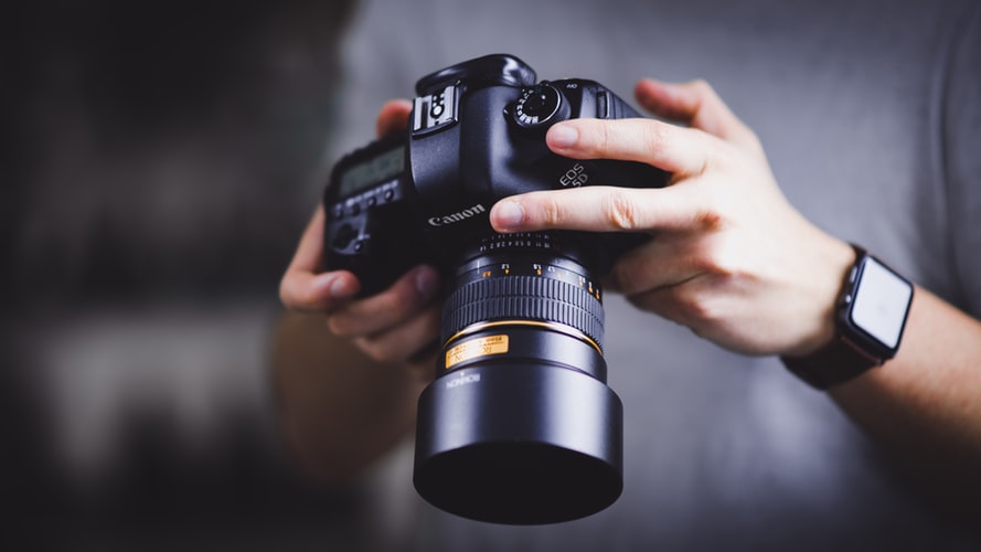
Visuals play a huge part in our decision-making process. It’s said a picture is worth a thousand words; it’s also worth a thousand sales. Photography has never been more critical in the online landscape, with the advent of Instagram and a growing focus on aesthetics leading to changes in how consumers interact with websites. If your brand’s photography is lacking, it can make you look cheap and unprofessional. Want to give your site a quick boost that has a lasting impact? Check out these tips for taking fantastic website photos.
Stand Further Away From The Subject
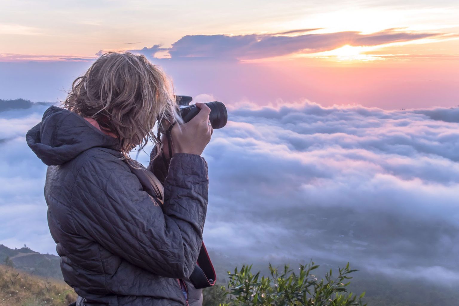
This tip is especially true for portraits, or the subject is a single person. Having a camera shoved in your face will make anyone feel uncomfortable. It seldom leads to a beautiful picture, but that’s not the only reason why you should take a couple of extra steps back the next time you do a shoot.
Shooting from a distance creates a much more professional looking image and makes the resulting photo easier to edit at a later date. The typical website makes use of a lot of full-width elements and landscape banners, meaning your photography needs to be wider than it is tall. Taking a couple of steps back adds space to the left and right of your subject, making it easier to crop the image without losing its focus of essence.
While your website won’t deal exclusively in wide banners, it does make things much easier for your designers and content editors. If you want to save yourself a few headaches and angry emails, stop the issue at the source.
Also check out Swami’s take on the Best Dash Cams In India
For Controlled Indoor Shots, Use White Background
Lifting an object out of an image that isn’t shot on a white background is a nightmare. What should be a simple Photoshop job suddenly becomes a much longer task. While there are methods and tools to help you with this, it is much more beneficial to do all of your product photography on white background from the beginning.
Doing this is like lending a hand to your editing team or future self. You are going to want to use these product images in other campaigns down the line, so think beyond the initial shoot with the creative background.
Non-white backgrounds are distracting and take focus away from the product. If you’re trying to sell a t-shirt and the viewer’s eye is drawn away to something happening in the background, you’re just losing business. Instead, make sure your products are placed on a simple background that allows their natural features to be accentuated.
Understand The Balance Of Lighting
Any great photographer will tell you one of the keys to getting a great shot is improving your use of lighting. Getting a well-lit photo isn’t about catching that one in a million opportunity from the sunlight or having the best equipment available; it’s about understanding the balance between the light and your subject.
Lighting can make a photo feel three dimensional. Everything from the time of day to the interior of a room can affect this. Shooting as the sun is going down, for example, will result in a softer light giving everything in your photo a warm glow.
It doesn’t matter if you’re using a smartphone or a professional camera, light can be adapted and manipulated to create some amazing imagery. Avoid using too much or not enough light in your images, or you’ll be left with washed out or shadowy photos, respectively. All your photos, specifically product and lifestyle shots, should have a crisp a clear appearance, a skill developed through experimentation with natural light.
Also check out Swami’s take on the Top Camera Drones in India
Keep Things Simple
The photography on your website doesn’t have to be award-worthy. It’s there to serve a distinct purpose or create a sense of brand identity; you’re not looking to create something people will pontificate over. You should keep images simple and remember their purpose.
This adage is particularly true for product photos. Modern websites are sleek, simple, and streamlined creations. Your imagery mustn’t sit at odds with that, as too stark a contrast can distract your audience and draw them away from the real focus of your website. Make sure your pictures don’t have huge distractions or contrasts and are framed without elements cut off at the edges. It may feel very hip and kooky, but it’s just annoying and distracting.
Keeping things simple is giving yourself as much chance as possible to succeed. Don’t overcomplicate the issue and try and run before you can walk in photography terms.
Rule Of Thirds
The rule of thirds is one of the simplest but most effective photography techniques you can learn and implement into your website imagery. Once you learn it, you’ll never take a shoddy looking photo.
When you’re taking a photo for your website, imagine a three by three grid on your screen (you may not have to guess as most modern cameras will come with this as a set feature). From there, try and shoot the main subject of your image to the side of the centre; or at a point where two lines intersect. This composition gives the image much more life than one where the subject is in the dead centre.
Even though you’re more contrived in how you shoot, you’ll end up with a much more natural image that will bring life and energy to your photographs.
Photography can be a difficult skill to learn and develop, but making incremental steps can result in massive changes. Take the time to learn these skills and give your website an overall much more professional feel.
Also check out Swami’s take on the Best CCTV Cameras For Home Security In India
We manufacture great photography t shirts ourselves. Check them out too!